Video chat designed and integrated into an existing cobrowsing product without disrupting core flows
Samesurf lets a support agent and a customer browse the same screen in real time without exposing sensitive data. My job was to add video and calling to the product, so live support sessions would need fewer outside tools.
Video and calling were new to the product, therefore, they had to work equally well on desktop and mobile. Problematically, the navigation was already overloaded, and screen space was limited. The question was: how do I add video without disrupting current users or overwhelming them, especially on mobile.

FRAMING
Defining video chat requirements
When I started, video chat was loosely defined, with no shared idea of what actions it needed or how it would fit into existing cobrowsing sessions. Before designing anything, I mapped the current product flow, the roles involved, and added video contstraints.
INPUTS
- Host and guest workflows from the start of a session to the end
- Entry points and session states on every device
- The interface elements a video session needs
- Layout limits on mobile and desktop
Focus
- Decide which elements always stay visible
- Prioritize controls by role and context
- Keep small layouts easy to use
- Settle the structure before the visual design
INSIGHT
Rethinking the navigation
Early exploration showed that video couldn’t just be added on top of the existing interface. The navigation was already doing too much, and adding video without restructuring would have made sessions harder to use, especially on mobile.
ZOOM HABITS
People expected video to work like the tools they already use, so familiar patterns would make it easier to learn.
OVERLOADED NAVIGATION
The existing navigation had no clear priorities and couldn’t take on a new mode without being restructured.
MOBILE LIMITS
Small screens exposed structural problems that the desktop layout had been hiding.


DIRECTION
Simplifying before adding video
I started by simplifying the overall interface to make room for video, reworking the navigation, entry flows and control placement before designing the video experience itself.
PRINCIPLES
- Use familiar patterns instead of inventing new ones
- Give primary actions priority in small spaces
- Design for the smallest screen first
DEPRIORITIZED
- Advanced video and microphone controls
- Edge cases in the first pass
- In-app tutorials
EXPLORATION
Testing layouts and controls
I explored layouts and control systems that balanced visibility, access and screen space: different navigation densities, floating versus fixed video controls, a pull tab to keep controls out of the way, and separate modes for cobrowsing and video. I asked the same questions of every control: Does it need to be visible all the time, or only in context? If two actions do the same thing, do we need both? How often is it actually used in a session?
Controls that were combined too tightly felt cluttered, some actions could move to secondary menus, and a slim navigation built around the main tasks tested best with stakeholders.


ITERATION
Refining with stakeholders
I refined layouts, flows and interaction states through weekly stakeholder reviews, focusing on clarity, predictability and whether hosts could manage a session without getting overwhelmed. The main changes were a simpler navigation, separate modes for video, cobrowsing and file sharing, clear states for mic, video and user roles, and reorganized actions for inviting guests, managing users and passing control.
This direction moved forward because it matched what people expected, worked on both desktop and mobile, and was clean enough for the banks and enterprise teams that use Samesurf.
SOLUTION
Bringing video into the product
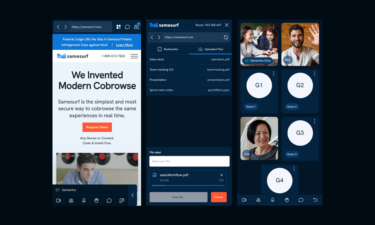
Video now works as part of the cobrowsing session instead of a separate tool. I reworked the navigation and entry flows for clarity, and kept the controls familiar on every device.
CONTROLS
Video and microphone controls in a simplified navigation.
Onboarding
A clear flow for joining a session.
Roles
Clear host and guest roles.
Navigation
A pull tab that keeps controls out of the way of the shared screen.
IMPACT
Aligning the team early
After final approval, I prepared the Figma file for engineering with states, prototypes, variables and documented workflows. The work gave everyone a clear picture of how video fits into the product, and the team agreed on scope, priorities and technical requirements earlier than on past projects.
Validation
Strong support from the CEO, CTO and sales team, clearer technical conversations about constraints, and engineering-ready files with reusable components and variables.
Next steps
Faster implementation once engineering started, and a foundation for future real-time features.
REFLECTION
Settling the structure and priorities early matters most when adding a new feature. Fixing the navigation and workflows first ke
I’m glad I asked my questions with the CEO and CTO in the same room. It surfaced technical constraints early and cut down on revisions.
I tried to manage the project in Notion, but the client didn’t want to use it. Next time a project covers several features on a short timeline, I’ll make a shared project tool part of the agreement, whether it’s Notion or something else.