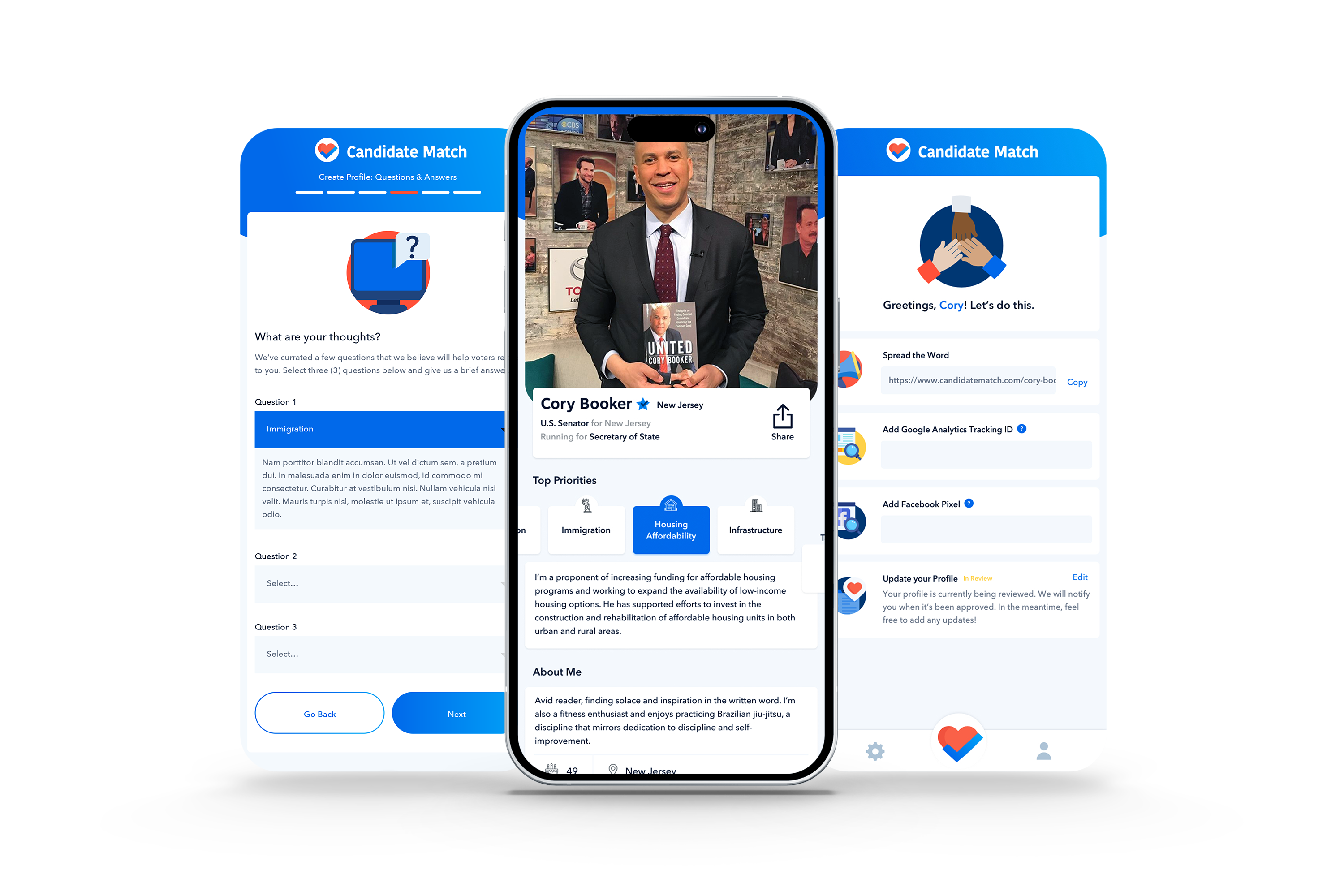
TOMS approached ATTN: with a dream to create a mobile app that could inspire a younger audience to vote. The Director of Product and I strategized an MVP that enabled candidates to answer campaign and lifestyle questions, showcasing their genuine selves to voters in a user-friendly interface. Voters could effortlessly swipe through the candidate profiles, learn intriguing facts about them, and conveniently add them to their roster for election-time consideration.
Swipe Right for Democracy and Smarter Voting
Hinge meets candidacy—voters can prepare their voting roster by swiping left or right on candidate profiles. Candidates can answer both campaign and personal questions to authentically connect with voters.

Scope
- Design a visual identity: logo, brand colors, brand typography
- Create a go-to-market strategy
- Design the UX/UI for candidate onboarding, candidate dashboard, and the admin approval process
- Pitch to the founders of TOMs and successfully gain funding